


They're everywhere -- ubiquitous to such an extent that they blend into the scenery. But considering the signs in store windows are often the lay person's primary interaction with hand-crafted design (as opposed to the professional, corporate design by committee they encounter everywhere else) The Critic felt it was time to examine these objets du commerce from the perspective of the design professional. What follows is a selection of hand-painted signs found along Clark Street in Rogers Park, accompanied by our honest opinions of what works and what doesn't.
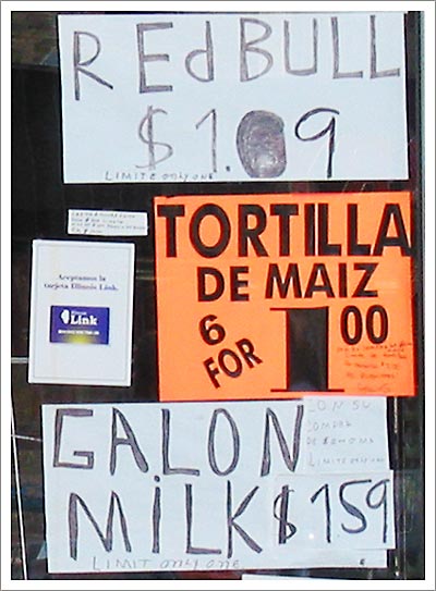
We lead off with a compilation of text-only signs. The font is rather haphazard -- set in a seemingly random pattern of upper and lower case, with a strange left-leaning italic in spots (the A and M in the milk sign). What's the motivation behind the filled-in zero on the Red Bull sign -- perhaps a bid for a edgy, Gen-X look? The designer should have enlisted a copy editor before going to print. There's little that undermines an advertisement more than poor grammar and misspellings.
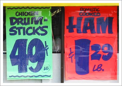
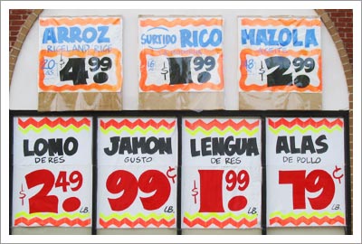
Now here's how to do it: Strong, direct copy, bold colors that draw the shopper's attention. The pair of signs even seems to provide shopping hints in the color choices -- the chicken drumsticks are less expensive than the domestic cooked ham, conceptualized in the posters through the use of green for the cheaper item and red for the costlier one. Taking the denigration of the ham a step further, what's with the "domestic cooked?" So the pig was raised elsewhere and cooked here? Strange message to send to consumers, not one of confidence. We're buying our ham elsewhere.
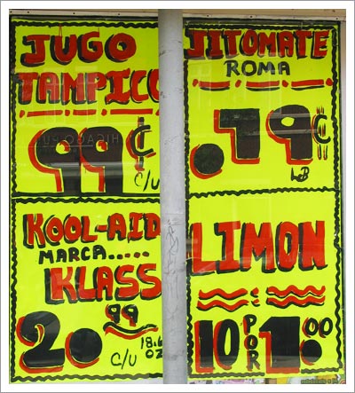
Here we have another collection of signs, although the designer has put much more work into them. There seems to be an attempt to make the signs readable by the blind -- hence the braille in the upper two posters. (Or is that morse code?) The colors are attractive, but again there are problems with the typesetting. The points in the prices are so big as to look like numerals themselves, leading to the mistaken impression that Kool-Aid is now $20 a package.
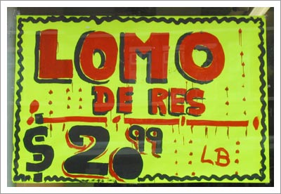
Lomo de Res is a cut of meat, and this sign certainly makes it look juicy. Too juicy in our opinion; the dripping blood is lurid against the bright yellow background, and frankly it makes us a little woozy. And again with the huge dot.
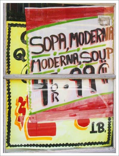
The designer of this poster is clearly a Warhol fan. Unfortunately, the effect is lost a bit without the silkscreen, but at least it's a soup can, right? Great effort in making it bilingual, an important nod to the make-up of the neighborhood. The designer clearly knows his/her audience. Now if only the store could have displayed it better, or at least taken down the previous signage.
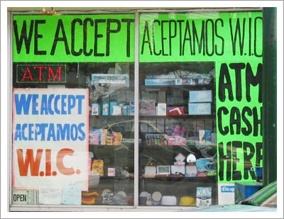
All right, we get it. You accept ATM cash -- who doesn't? I've yet to encounter a store that won't take my cold hard cash, even if it's out of a dirty Cash Station. Hopefully that's not this store's greatest selling point. And the light-up ATM sign is just overkill.
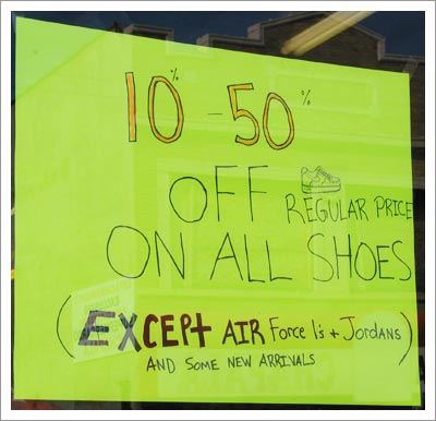
The copywriting is weak, and it's not helped much by the off-center layout and strange emphasis on "EXCEpt AIR," which takes visual precedence over all but the 10-50% line. And really, it's probably better to keep the fine print under wraps until the customer is in the store and trying on shoes -- sell the sizzle, not the grill marks.
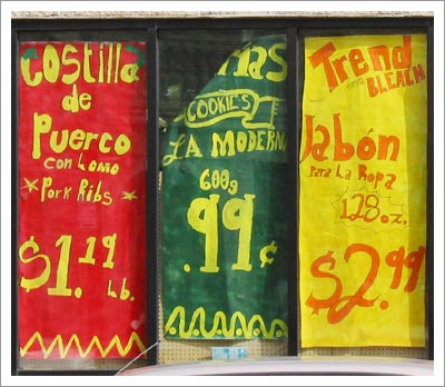
This is what happens when you let your art department run away with a project. Apparently working with a Rastafarian theme, the red, green and yellow form a solid visual block that's sure to stand out, however the font choice leaves something to be desired. The hand-written look is nice in some instances, but here it looks cutesy, almost too girly, as if the target market for this store is 13-year-old girls.
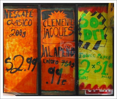
In the next window over, the rasta theme has been abandoned in favor of a more consistent color palate, which doesn't quite work. The mottled orange in the Nescafé ad reminded us of a Cheeto, while the design around the So-Dri logo simply confused us. Is it meant to signify paper towels, or is it just an attention grabber? Also, bright green text on a yellow background has poor legibility issues. We'd recommend doing it over with a higher-contrast color scheme.
This display is one of the best we've seen here today. It's well balanced, framed nicely by the architecture of the building. The colors are bold, the font is legible and appealing. Red, blue and yellow draw the shopper's attention, while the copy is clean and direct. No time is wasted, and it makes for a very promising ad.
