


| « Hawks Still Alive Against Red Wings | 3 Things The Blackhawks Can Continue To Do Vs. Kings » |
White Sox Thu May 30 2013
Best and Worst Looks in White Sox Uniform History
 In honor of the 1983 White Sox - the division-clinching "Winning Ugly" team that reached the postseason for the first time in 24 years - the 2013 White Sox have been wearing home throwbacks on Sundays this season. The reactions have been mixed. Some love the look; some hate it.
My thoughts fall somewhere in between (we'll get to that). But since the Sox have been wearing '83 throwbacks this year after wearing '72 throwbacks last year, it got me thinking: what have been the best and worst uniforms in White Sox history?
The team has had many different uniforms over their 112 year history. They've been the anti-Yankees: their current black-and-white look is by far the longest the club has gone without overhauling their unis, and it's only been 22 years. As you're about to see, the Sox have been more than willing to mix things up.
To give credit where it's due, I used the fantastic Dressed to the Nines database for the year-by-year history. I searched Flickr and Google and stumbled upon some nice photo collections. I'm a daily Uni Watch reader (it's the first site I go to every morning), and Paul Lukas wrote a nice 2008 column on the evolution of the Sox's uniform.
Here are, in my opinion, the worst and best White Sox uniforms over the years.
WORST
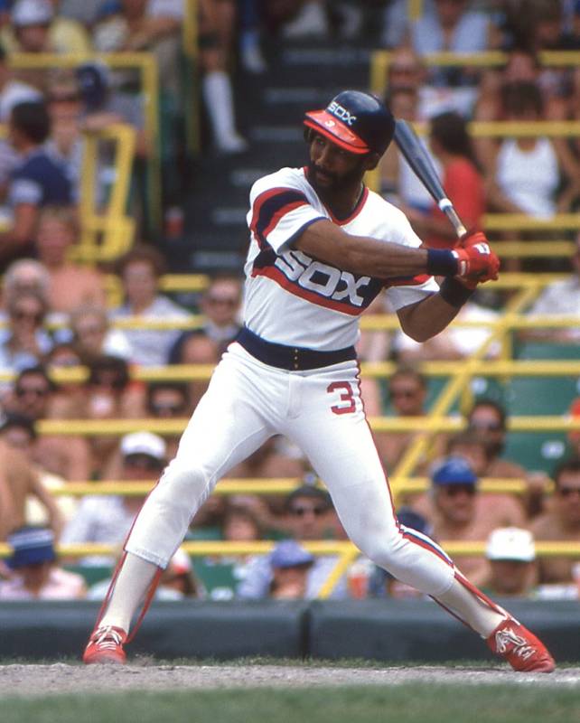
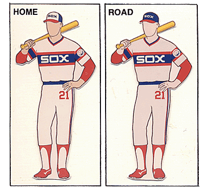
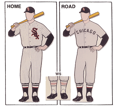
5. 1983 - I didn't know where to put this. I really like the logo, and the Sox wordmark on the jerseys and caps is bold yet simple, but the uni itself is loud. It's the poster child of the pullover era, totally a relic of early '80s baseball. They're fun to see once in awhile, just to mix things up, but I wouldn't want these to be the normal set.
4. 2003 - I don't care for the vests. They looked really good back in the day when Roberto Clemente stepped into the box at Forbes Field; they looked really sloppy when Aaron Rowand was manning center field. I'm not sure why, but several MLB teams went with vests in the early 2000s. It could be worse for the Sox, though - they could've been the Royals.
3. 1931 - The last year the team wore a monochrome uniform set until the late 1970s, and for good reason. Baseball jerseys are just better when all-white is worn at home, and all-gray is worn or the road. It's just the way the game has always looked, even if it's for the most antiquated reasons. The beauty of the baseball uniform comes from how a team dresses that template up. So, a Sox team wearing all-blue - and a darker blue, at that - is really funky looking.
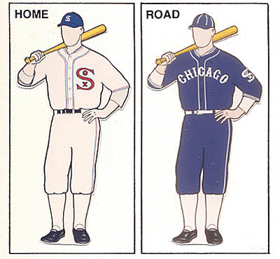
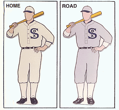
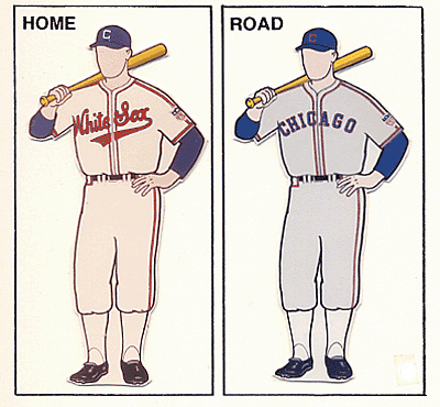
2. 1923 - But on the other hand, this is not how you use white and gray. Really lame set, same design for road and home. The "SOX" logo is cool, but everything else screams generic little league jerseys. Chicago wore these for the early half of the decade.
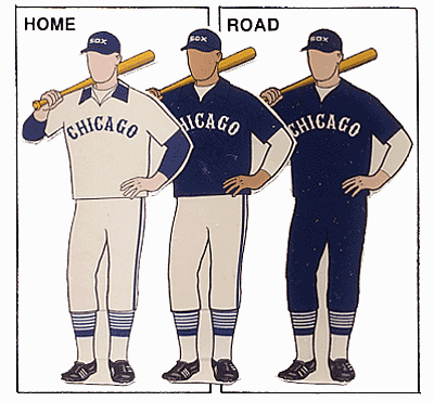
1. 1979 - Kind of a ridiculous look. Weird for the sake of weird. Collars on an untucked pullover, softball tops, old Western style fonts... just an odd time in the late 1970s (I assume, because my dad was only a teenager then).
I would love these unis if they didn't feel so forced. Bill Veeck was a colorful guy and all - he was responsible for names on the backs of jerseys and for shorts in baseball - but this look was a miss for me.
BEST
5. 1989 - I love these uniforms. Love them. They're great. My vote for the Sox's most underrated look. Really clean, really classy. They remind me of baseball, or maybe a softball beer league. I like the script "White Sox" with the swoop on the X, and I like the cursive "Chicago". The cap logo is really nice, too. Only downside is the dark blue/red color scheme, which half the league uses.
4. 1942 - I'm a sucker for script. It just feels more baseball-y. Chicago only used these home uniforms for one year.
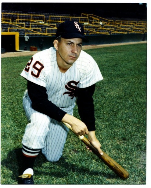
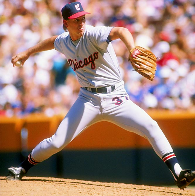
3. 1968 - Hey, it's a blue uniform!!! I like the blue pinstripes and the script powder blue unis. I also dig the Illinois 150th birthday patch on the sleeve. For whatever reason, I've always loved envisioning current uniform sets in different colors, and this look was never really repeated (The Sox never throw back to 1968, maybe it's because they went 67-95).
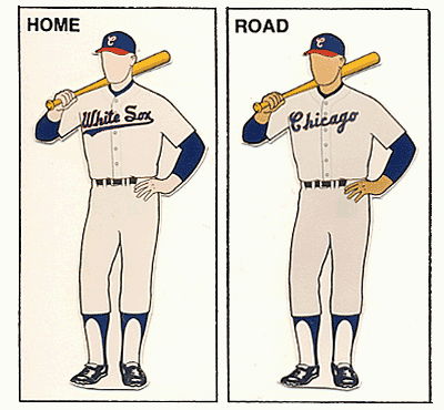
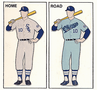
2. 1959 - Really sharp look, sort of what they have now only with a red outlining. The Sox used this same set for most of the 1950s and the early part of the 1960s, but the 1959 set stands out for obvious reasons.
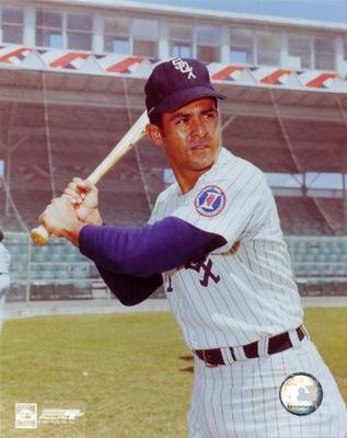
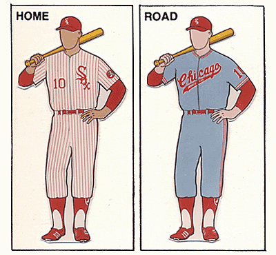
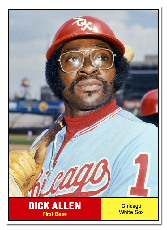
1. 1972 - Best of the best. Love all the red (not many baseball teams wear red primarily), love the home uni set, the powder blue aways, and the super large numbers on the back. The sleeve patch is a keeper. It all reminds me of Dick Allen smoking a cig in the dugout while juggling baseballs. The set is also an outlier in White Sox history - the club never wore red before or after the early 1970s.
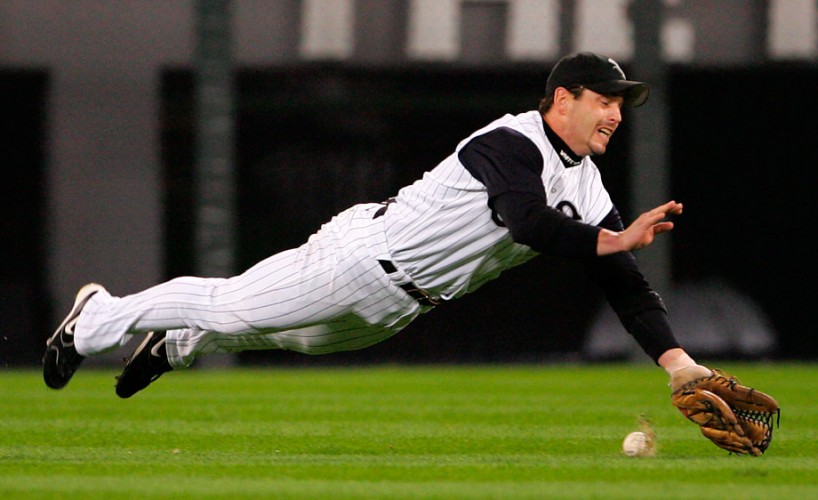
The current uniform set is a pretty good one: Simple black pinstripes at home, solid grays on the road. They have a classic hat logo, too. A lot to like. And, when the club wears their 1983 alternate throwbacks, you notice. Like it or hate it, you will have an opinion either way.


.jpg)
Ted Machnik / June 1, 2013 5:23 PM
1972 White Sox uniform set was perfect. I would replace 1942 with current Sox set (whites at home, greys for the road only). Nice job!