


| « The End is Just the Beginning for the Cubs | Freelance Wrestling Showcasing Talent Halloween Eve » |
Bulls Mon Oct 26 2015
Bulls Ushering in New Phase with Court Redesign
 The Chicago Bulls have rarely strayed from their roots. Throughout their 49-year existence, they have maintained the same design, color scheme, and logo for their franchise. There have been some tweaks here and there, but if this gif is any explanation, they are quite confident about how their logo looks. But for the 2015-2016 season, the team has decided to deviate from the norm and introduced a new court design in September. The new floor is a great mix of old- and new school and still prominently features the bull logo in the middle.
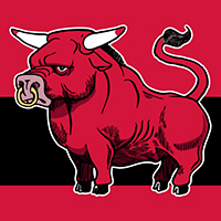
Let's first take a moment to appreciate the Bulls logo. The standard bull design is a classic that isn't too cartoonish or intense on the eyes. There may be some hometown bias, but the national pundits have praised the logo over the years.
Now that our appreciation is out of the way, let's take a look at the new court design. Even the slightest change of a logo, court design or the positioning of one letter on a jersey is heavily scrutinized by the league. They are invested in all of these teams and a new design may skew their business model. With the Bulls' drastic new court look, they obviously gave the A-OK for a relaunch.
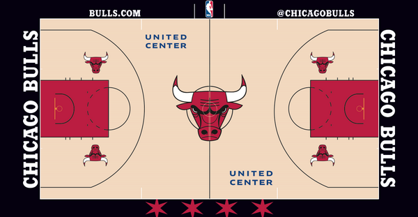
Center Court Logo
It may not look like it at first, but the center court logo is actually 75 percent bigger than the previous incarnation and does not have a basketball behind it. Teams in the NBA have been experimenting with drastic court redesigns the last few years, some good and some bad, but it's still a pretty cool idea that they kept the core of their old court intact. The Bulls have four other logos on the court, two positioned on each side of the court. The story goes that when the Bulls moved to the United Center from the Chicago Stadium for the 1994-1995 season, head coach Phil Jackson ordered for those logos to remain because it helped him run plays better. Jackson could wield so much power during that time that he forced the team to redesign the court to suit his playmaking.
Lettering
![]() I have to say, this is my favorite adjustment. It may be the nitpicking writer in me, but I love how they changed the type for the baselines and sidelines. No longer will we have to endure the puffy-lettering of yesteryear. All of it is based off the official team font, which I think gives the court a great, cohesive look.
I have to say, this is my favorite adjustment. It may be the nitpicking writer in me, but I love how they changed the type for the baselines and sidelines. No longer will we have to endure the puffy-lettering of yesteryear. All of it is based off the official team font, which I think gives the court a great, cohesive look.
Even more exciting is the positioning of the four Chicago stars at the front of the court. The outline is still black, but the bold red stars make this section of the court pop.
Rebranding is very common when teams are trying to start a new phase of their franchise history. The team is not totally starting over, but it is a cool new look to help begin the Hoiberg era. A lot of players are in the tail end of their career and it might be now or never for this club. With the exception of the occasional Los Bulls jerseys and the Vanilla Coke-designed Christmas threads, there may not be more change for the Bulls look besides the court this year. But hey, if it ain't broke, don't fix it.


